Better than "The Pizza Tracker" Case Detail Redesign
UX/UI DESIGN | INFORMATION ARCHITECTURE | RESEARCH | DESIGN SYSTEM
OVERVIEW
Coverpath is a life insurance sales platform by MassMutual, that allows the purchase of a fully underwritten convertible term or whole life insurance policy online.
At the end of 2020, we were tasked with designing a feature to assist financial advisors in gaining a clearer understanding of the status of their cases from applying to having a policy issued for a life insurance policy through Coverpath Account Center.
We had the "Domino's Pizza Tracker" on our minds since it was one of the first applications that provided customers with real-time data, from placing their orders to delivery.
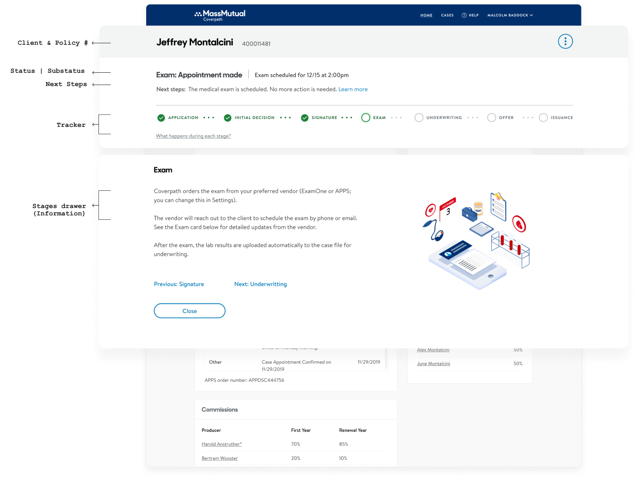
A tracker became the idea we wanted to explore and update our users as their cases moved forward, but the "Case Tracker" needed to be real & accurate.
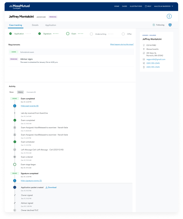
With a month timeline, we built and launched the "MVP of the Case Tracker." It was a good start, but we knew there was more to do.
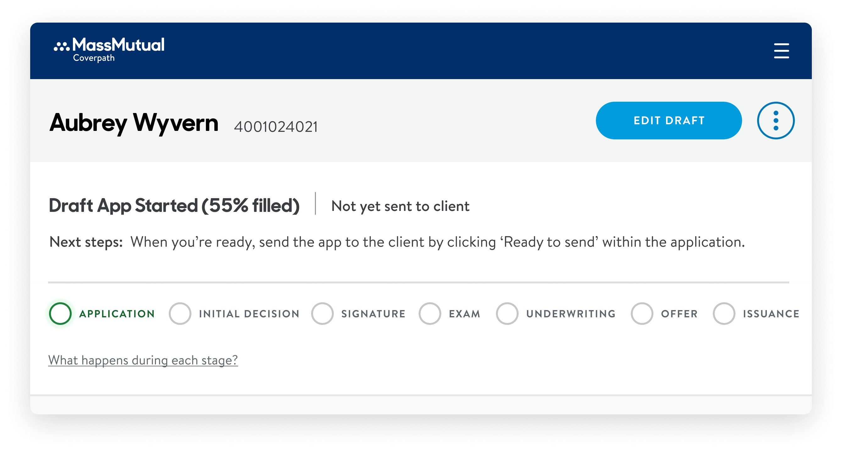
Previous design
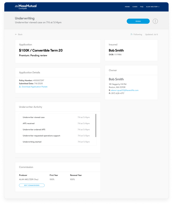
mvp design
AFTER MVP LAUNCH
As a team:
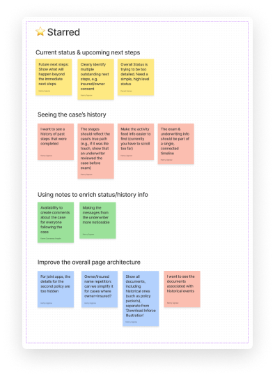
We started brainstorming sessions, researching, sketching, asking questions, and revisiting older user tests, findings, and insights from the field. This led us to visualize our strategy and roadmap for the upcoming months.
My role:
I researched and started sketching different ways to present the main content, mapped everything out, and identified pain points related to my gathered context.
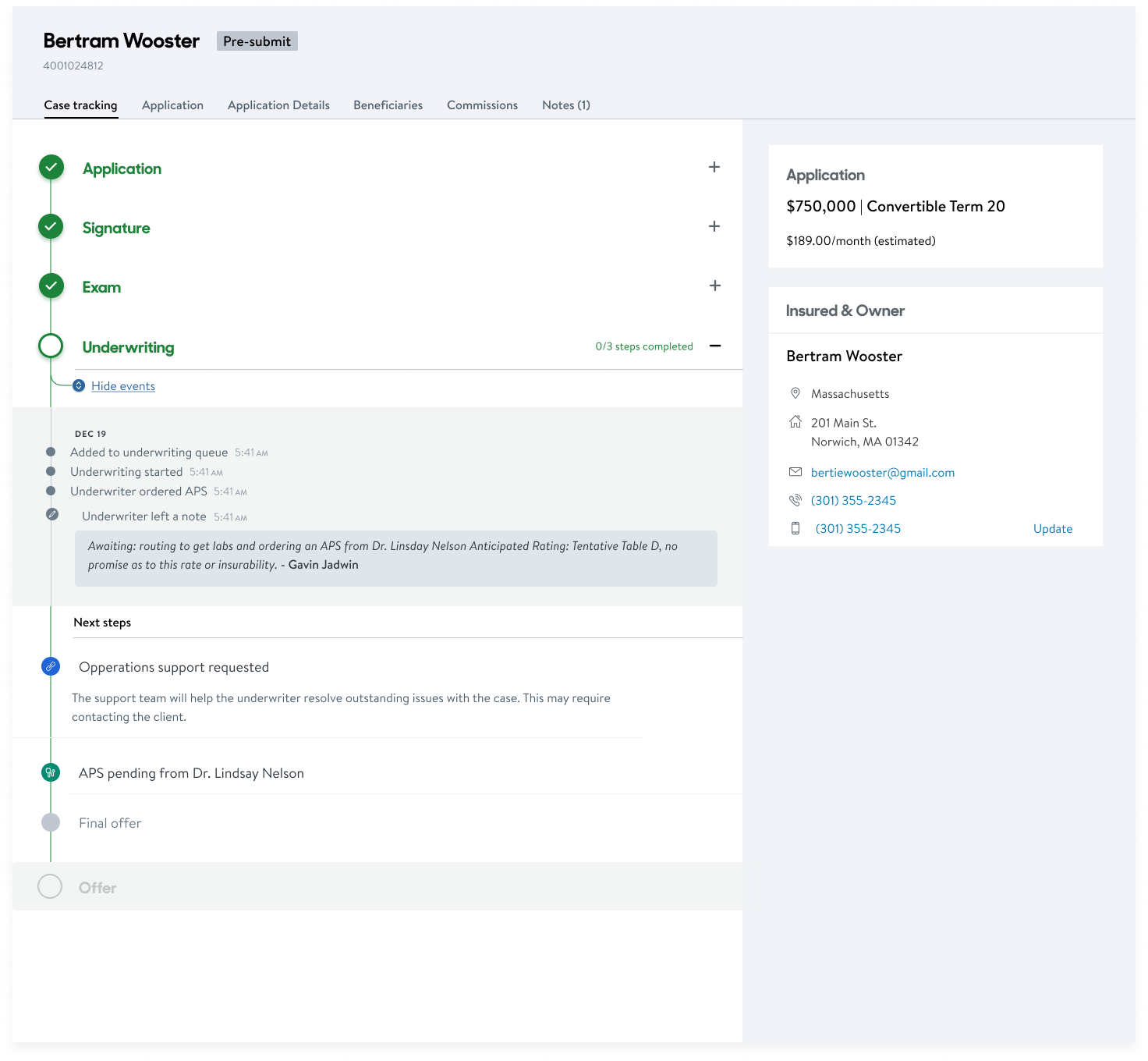
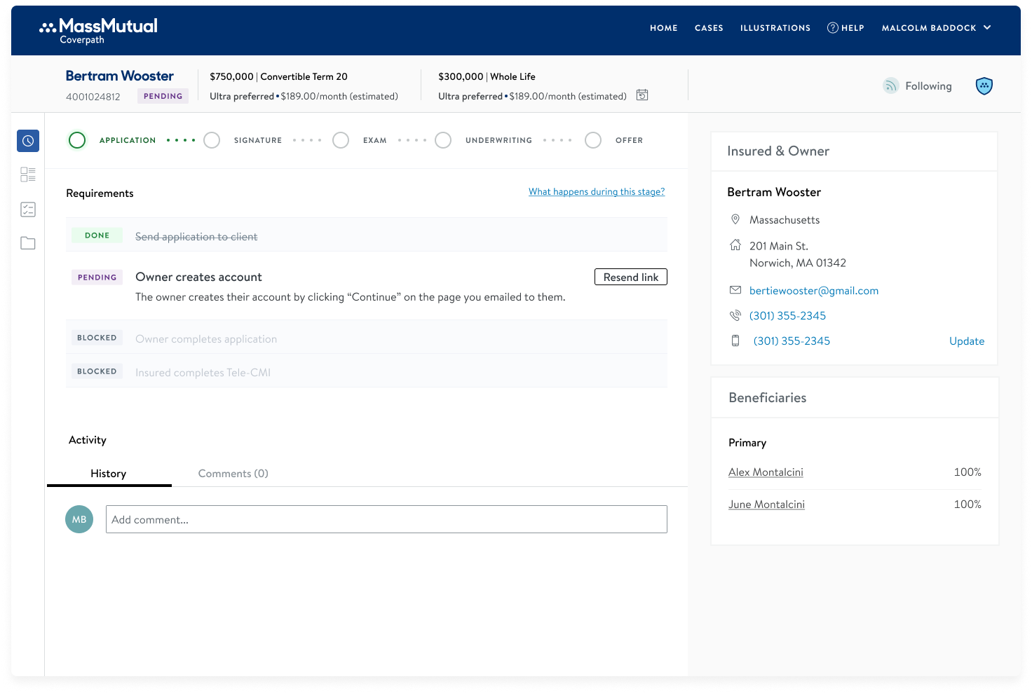
Then, I identified pieces of information I could group into logical steps and continued to iterate until I found a layout from which we could strategize the case detail page. I designed all possible scenarios per stage and wrote details into documentation; this is a crucial part of the design. In this case, it allowed us to know we were aligned in everything and made the handoff of each part easier.
WHAT WERE WE TRYING TO SOLVE?
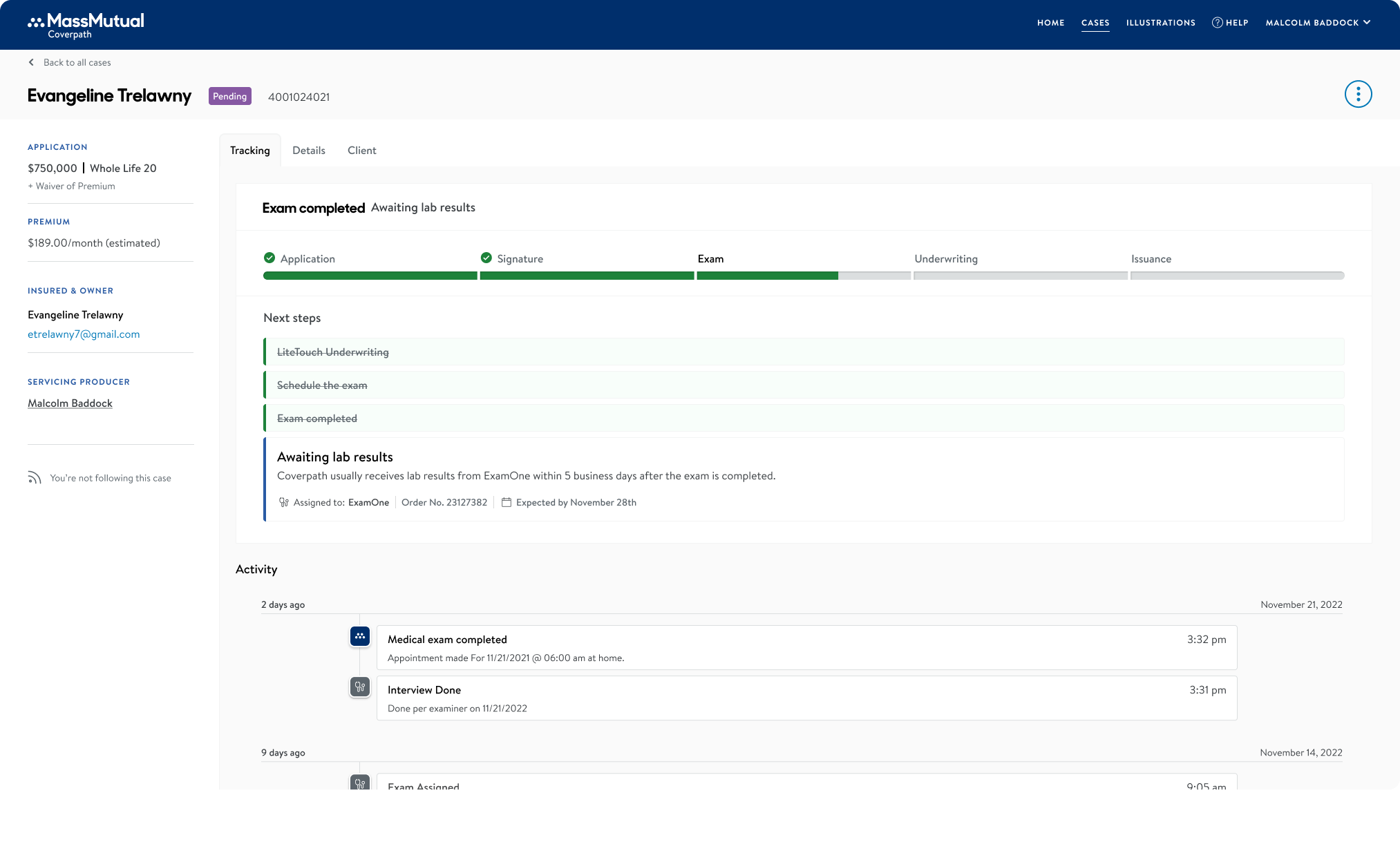
At a high level, we wanted to help financial advisors know and understand where their case stands in the overall process, and what needs to happen to move forward.
THE SOLUTION
Three key aspects:
1. Current & upcoming next steps.
- Give details and the overall status of the life insurance application.
- Identify multiple outstanding next steps, e.g., insured/owner's consent.
- Give the user a glance at what happens beyond the immediate next steps.
2. Seeing the case’s history.
- See the history of past steps that
were completed. - Activity feed should be easier to find, and a single collected timeline.
- Bringing Underwriting and Exam cards into a single timeline.
3. Improve the page architecture.
- Avoid repeating information (e.g., when the owner/insured is the same person)
- Joint applications improve how they visualize each policy side by side pre-issue
Application in Exam Stage
MVP DESIGN
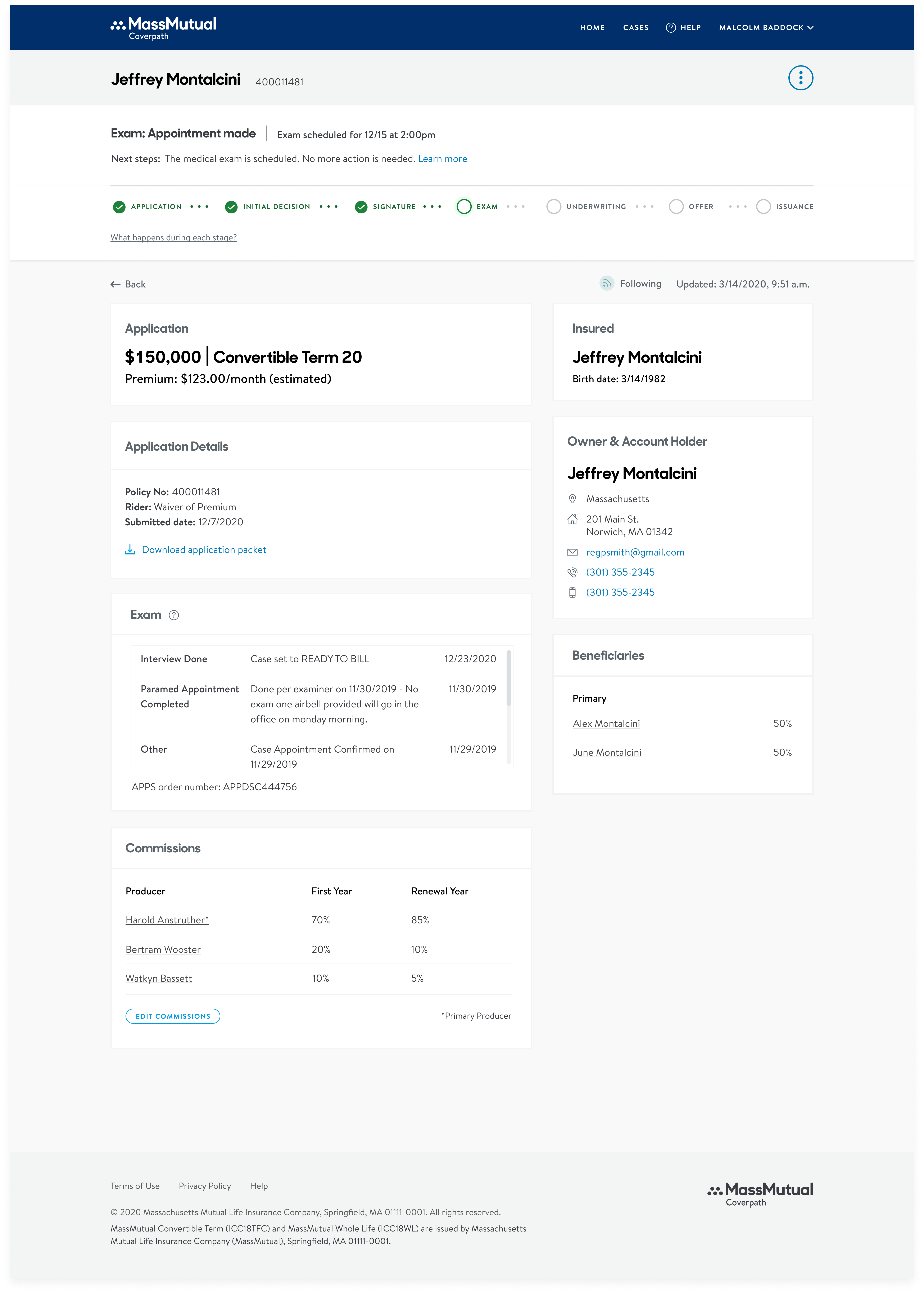
UPDATED DESIGN
AFTER DESIGN
Moderated user testing
What I did:
I tested five use cases of the new concept for the case redesign project, and presented a comparison against the previous design.
I aimed to answer these questions:
1. Can they determine the status of a case and what needs to happen next?
2. Do they prefer the new or the old design?
3. Can they determine the status of a case and what needs to happen next?
Who participate:
3 NBC’s & 4 Advisors from different firms and familiar with Coverpath.
What I showed:
A prototype showing 5 different cases. At the end of each, I showed a comparison of the old vs new design.
PREVIOUS DESIGN
ALTERNATE DESIGN
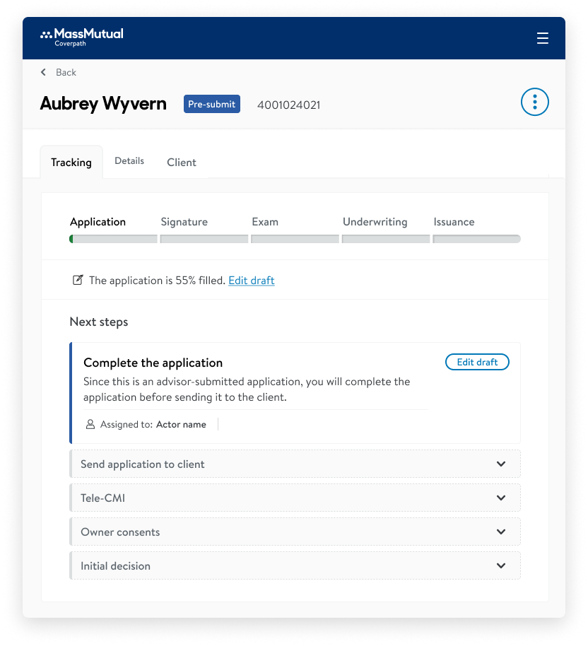
TESTING
Outcomes
5/5
An avarage of 5, testers felt confident to understand the status of their case.
6/7
Preferred the new design vs the old design.
7/7
Of the testers felt confident about what needs to happen in the case to move forward.
“I definitely like this new design, because the more details you give us, the better we’re going to understand it. I really like the part where it’s crossing out what’s already been done… so that people don’t have to guess whether that happened, especially if they’re new.”
– Jessica T., New Business Manager
“I wouldn’t change a thing… This is more of what we’re used to when we look at our workbench [the competitor system]. This is actually easier and better written… the presentation of the information is better. And this is hands down better than what we currently have in Coverpath.”
– Shad, Agent
“Just knowing that this is on the horizon and is being worked on…
I can’t tell you how happy this makes me”
– Katie F., New Business Coordinator
Examples of an underwriting case
Final design
🎯 The impact so far:
- We worked on this for over a year, and it will be launched in the Summer of 2023. We know advisors are eager to get it since it will require fewer calls to customer service.
- Positive response. So far, we have had a very positive response from advisors and business coordinators because everything seems to flow and is easier to navigate.
- Ready for other clients. During the design and development phase, we ensured we were building it, thinking of other clients so everyone could benefit from this work. I connected with the design system team and development to collaborate to add new components and patterns to the library.
✏️ What I learned?
- Documentation. Throughout the project, create a document outlining specific context and links, decision logs, explorations, and next steps. A team may pick up the project again or find value from your research and explorations for this or any other project.
- Reach out to other teams. Ask everything you need to ask. When a project has data coming from different areas, it is essential to maintain communication across all teams and bring to your team so everyone is aligned with the concept's details.
- Iterate again & again. Don't believe something is ready just because. Test it & iterate if there is time. Having explorations can help you with this, and you know that maybe the right result was one of the first ones, but at least you tried to find a better one.
🎉 WOAH! Thank you for getting this far!
I want to ensure everyone I worked with on this project is called out. They are hard workers, detailed, smart, and fun! It was a pleasure working with you, in this and many other projects. 🙏🏻 Henry Agnew(UX Lead, The Best!!), Daniel Kahan(PM), Reeve Barthelme, Ziyang Zhang, Maggy Thompson, Ben, Lingchao (Dev team), and Vikas Chatrad (QA).
© KAREN CAMARASA 2023
