Crafting an omnichannel experience. Joann.com
UX/UI DESIGN | INFORMATION ARCHITECTURE | E-COMMERCE
OVERVIEW
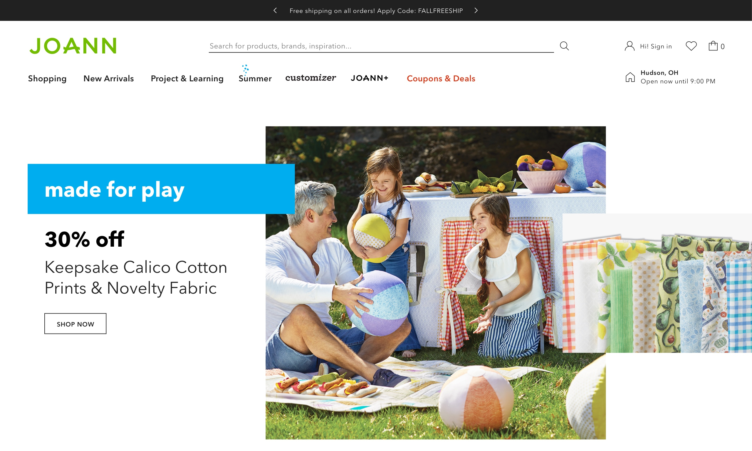
JOANN is the leading fabric & craft specialty retailer with 865 stores in 49 states.
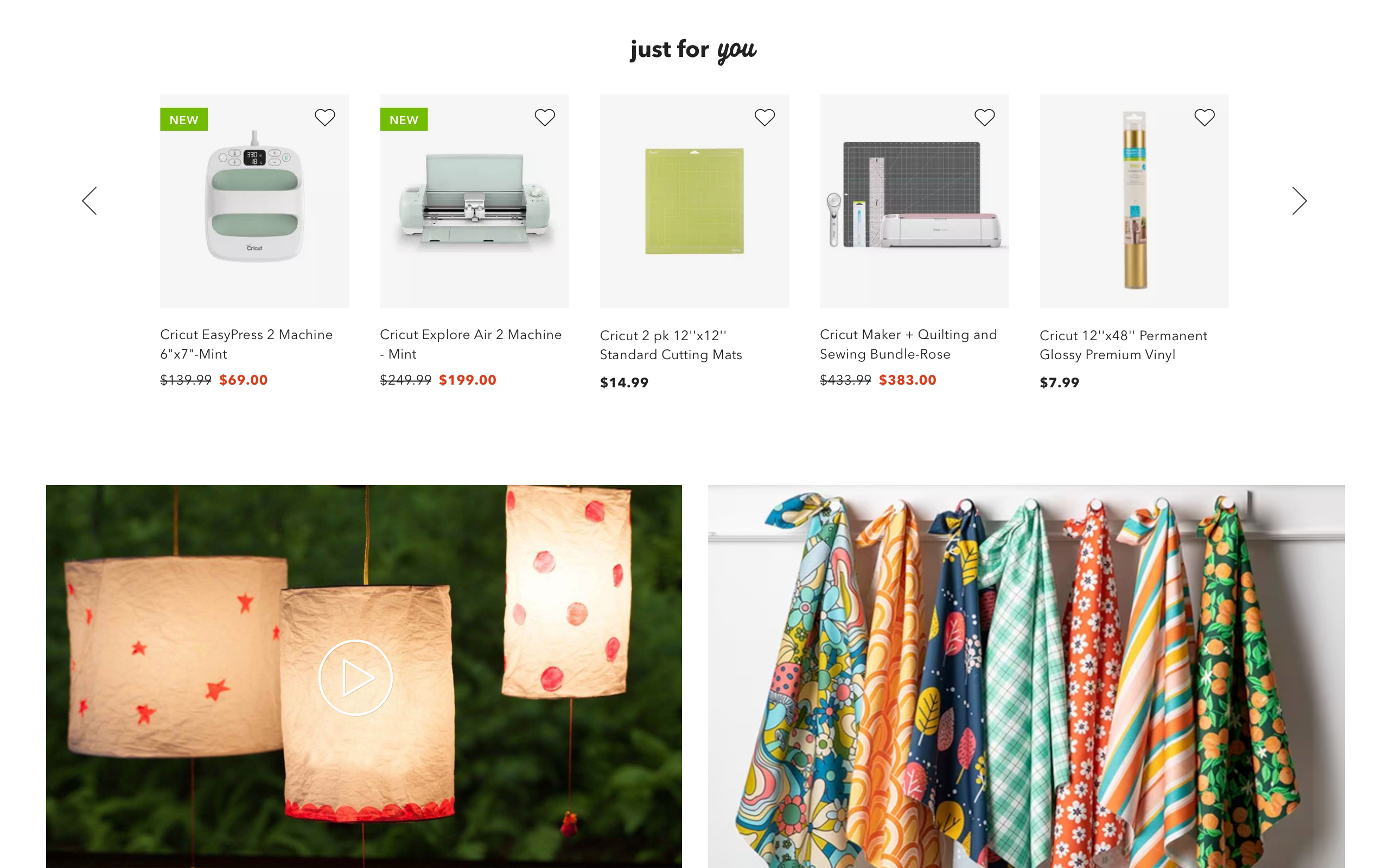
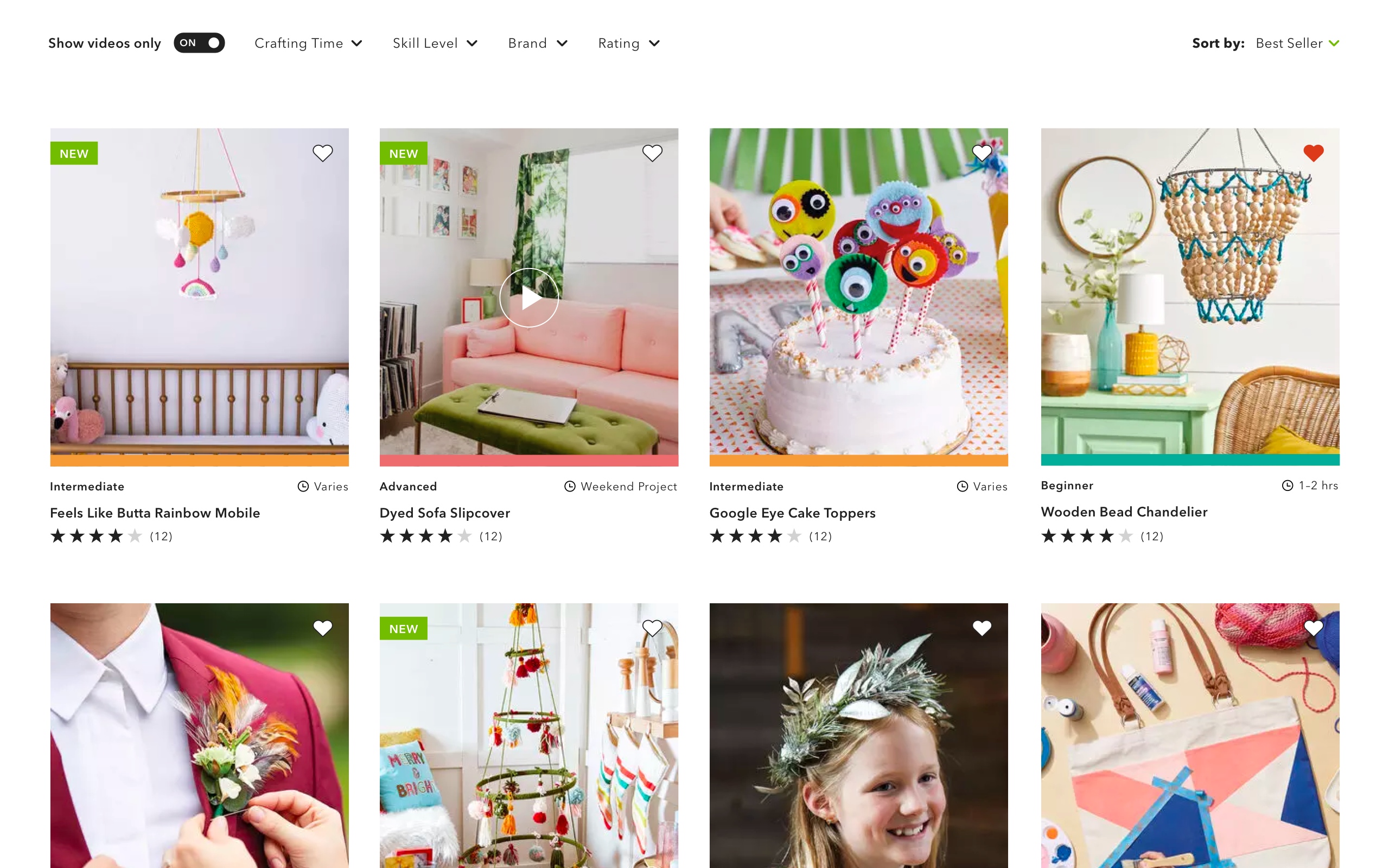
We got the request to refresh the Omnichannel Experience. This would be achieved by updating their navigation, redesigning the easy wayfinding of their extensive catalog (+200,000 items), and making the user's experience compatible with omnichannel.
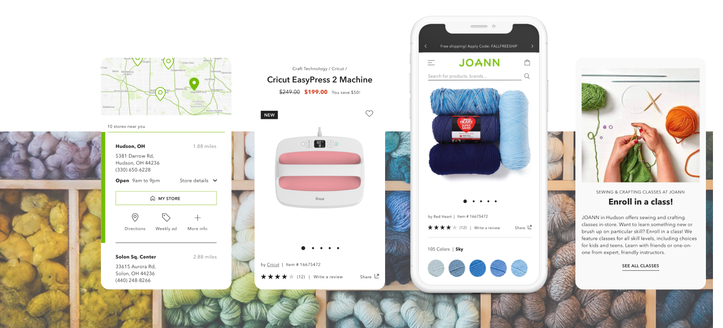
The overall goal was to update the platform mobile optimization, checkout, look & feel class registration process, and redesign product listing and detail page experiences. All while keeping accessibility standards in mind.
THE CHALLENGE
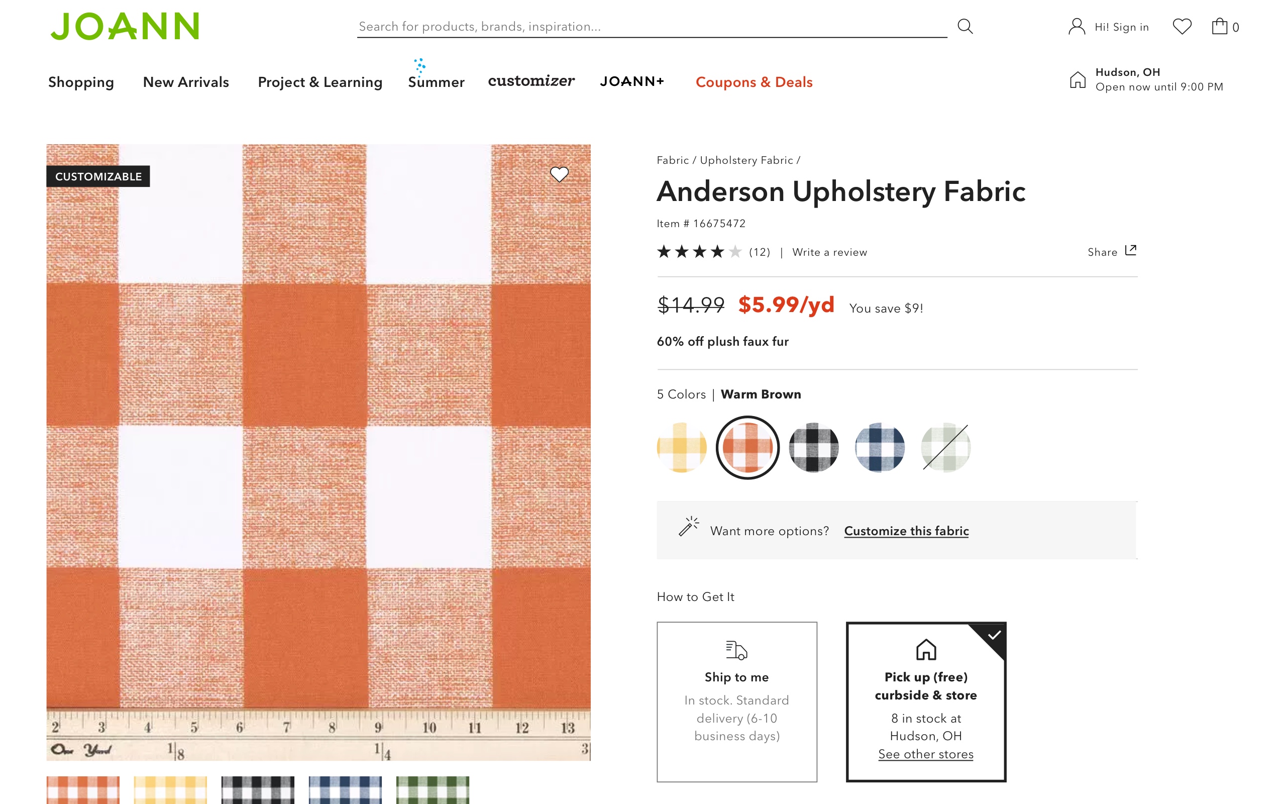
We aimed to train the internal design team to use a modular design, a modern approach to designing digital experiences that enables faster and more efficient development while maintaining consistency, accessibility, and scalability.
Incorporating this approach required me to work closely with their internal design team to ensure they had the skills, tools, and knowledge to implement the new designs successfully.
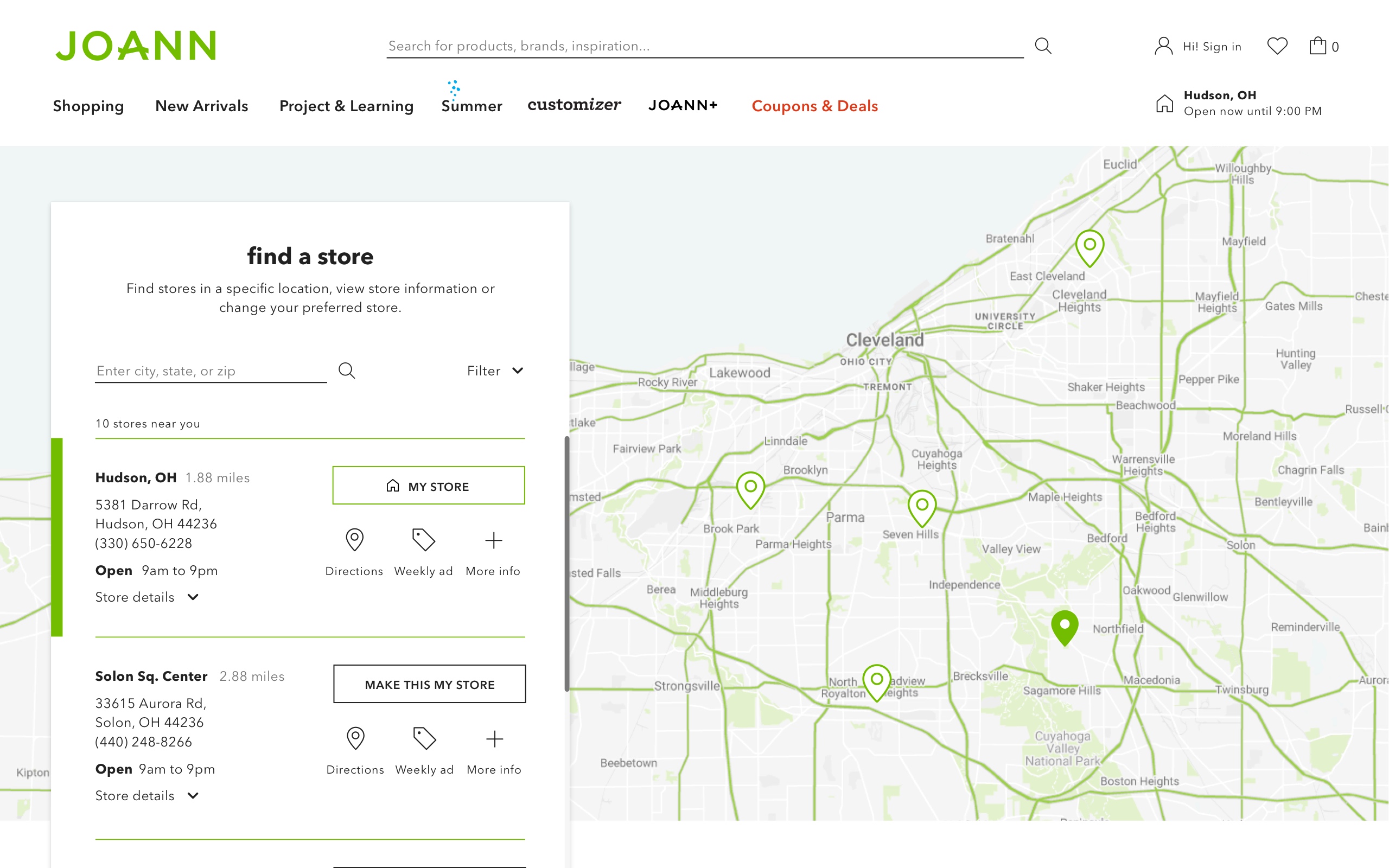
In addition, I had to ensure that Joann's customers were aware of the omnichannel purchasing options by clearly and effectively incorporating them throughout the purchasing experience.
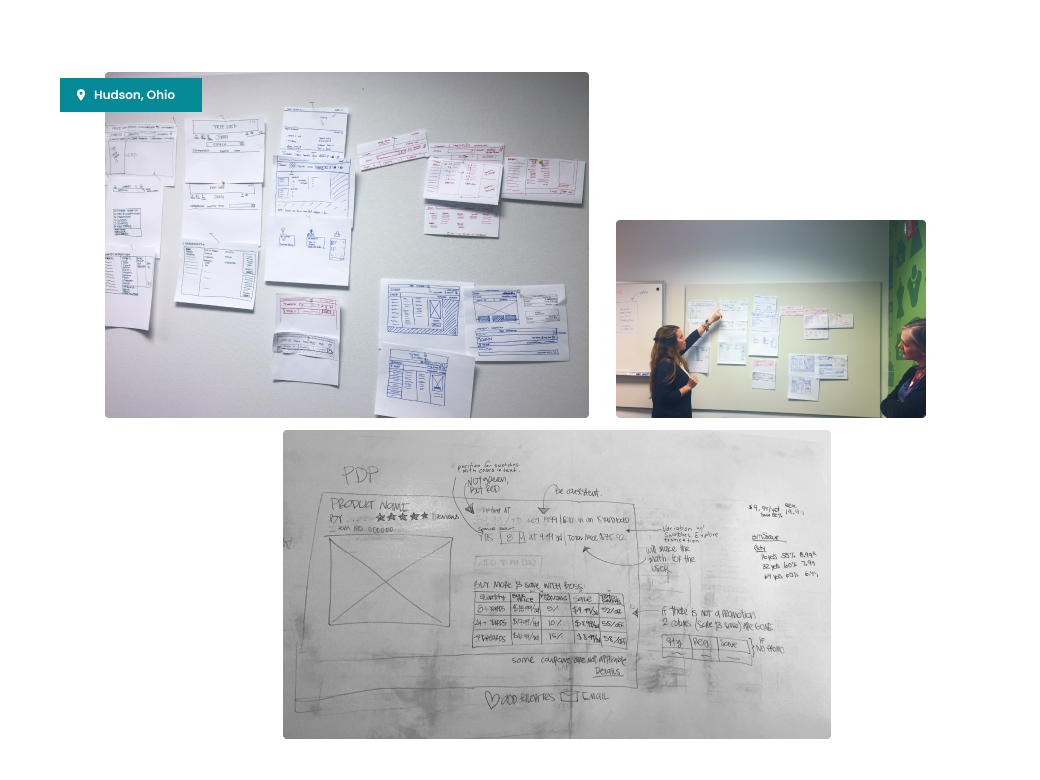
Workshop with Joann's marketing & internal design team.
THE PROCESS
I worked closely with the senior UX Designer. She laid out the navigation taxonomy, and I designed the experience and interactivity of Joann's new navigation, which made it easier for customers to find and access the full line of products.
We conducted discovery and workshop sessions, onsite tours of imagery, and rounds of user testing, which provided insight into the best way to enhance the website experience.
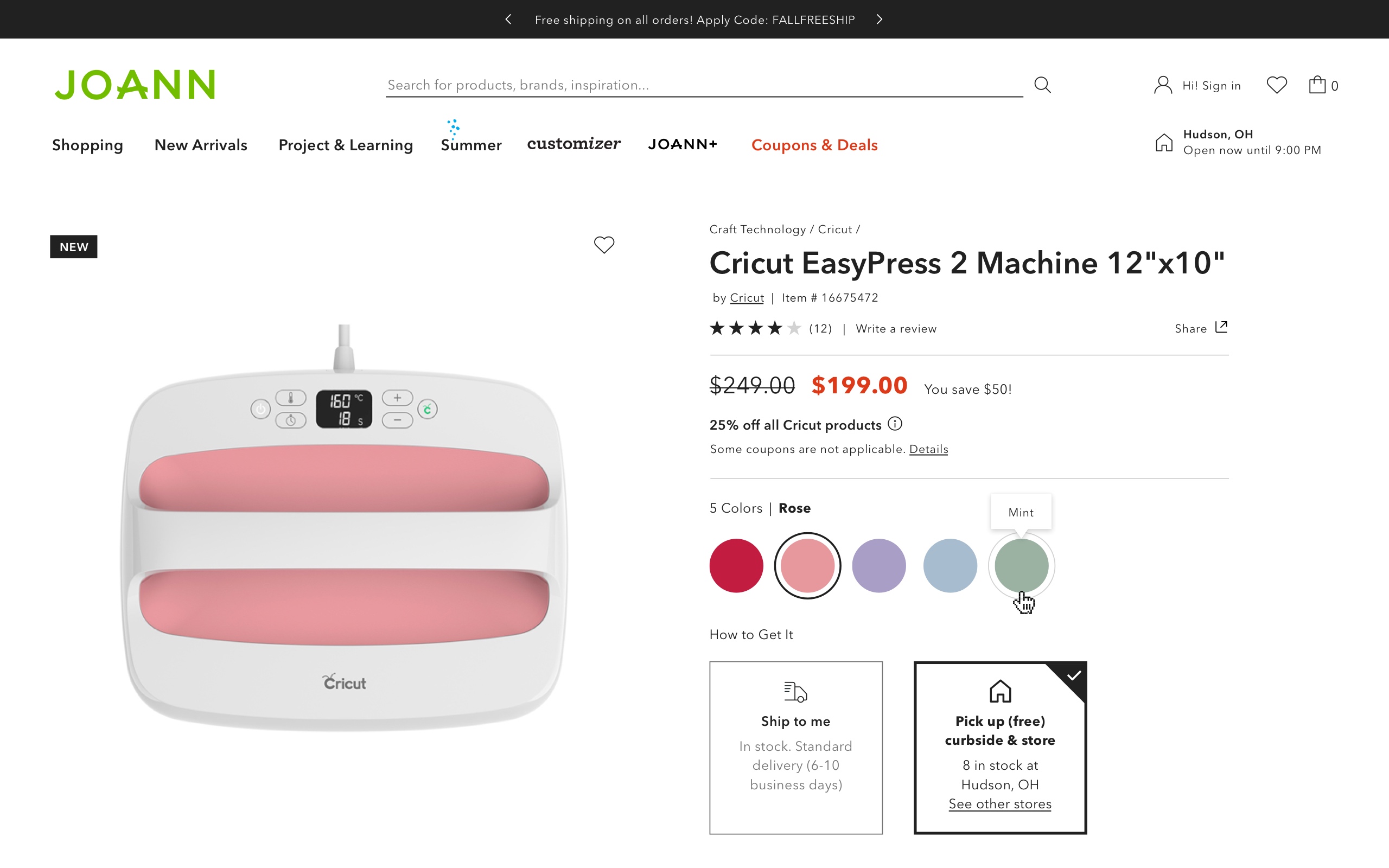
Recognizing the growing trend of online shopping and the convenience of in-store pickups, I strategically redesigned the purchasing experience. The new design strongly emphasizes buying online and picking up in-store (BOPIS) for all categories of products, from craft machines, materials, and fabrics to customization of a fabric tool and the ability to shop in bulk.
THE OUTCOME
Since I joined the agency, Joann was my primary client. As a long-standing client JOANN Fabrics has benefited from ongoing optimization.
With the most recent update, the website supported a massive spike in sales (77%) during the COVID-19 pandemic. Focusing on BOPIS was crucial to its success since it allowed customers to search the entire inventory and easily choose their buying preferences.
💡 MY LEARNINGS
- Design for the ideal solution, thinking about limitations but not worrying about them until later.
It's good practice to explore different concepts to determine the best experience. Doing this allowed me to have conversations with my team and clients, and then we started making decisions and compromises if needed. - Testing proved a new journey.
We were very focused on specific users; until testing, we found out we had many 60+ years old, were not tech-savvy, and we needed to make their experience straightforward and accessible. We were happy with the result we ended up with because it allowed us to provide a consistent experience for a wider age group than the experience they usually get in-store. - Document the work.
Connecting with an internal design team from day 1 was very important; I wanted to provide help as we moved through the sprint work. However, this help required extra out-of-the-box work to provide the necessary documentation to continue making the needed iterations to the content per season.
✨ Thank you for reading!
I loved this project; it gave me a lot of learning, satisfaction, and the opportunity to work for more than a year with a great and dedicated team! Huge shoutout to my team (Anita, Lee, Gilan, and Eli), who worked on this massive project!
© KAREN CAMARASA 2024
